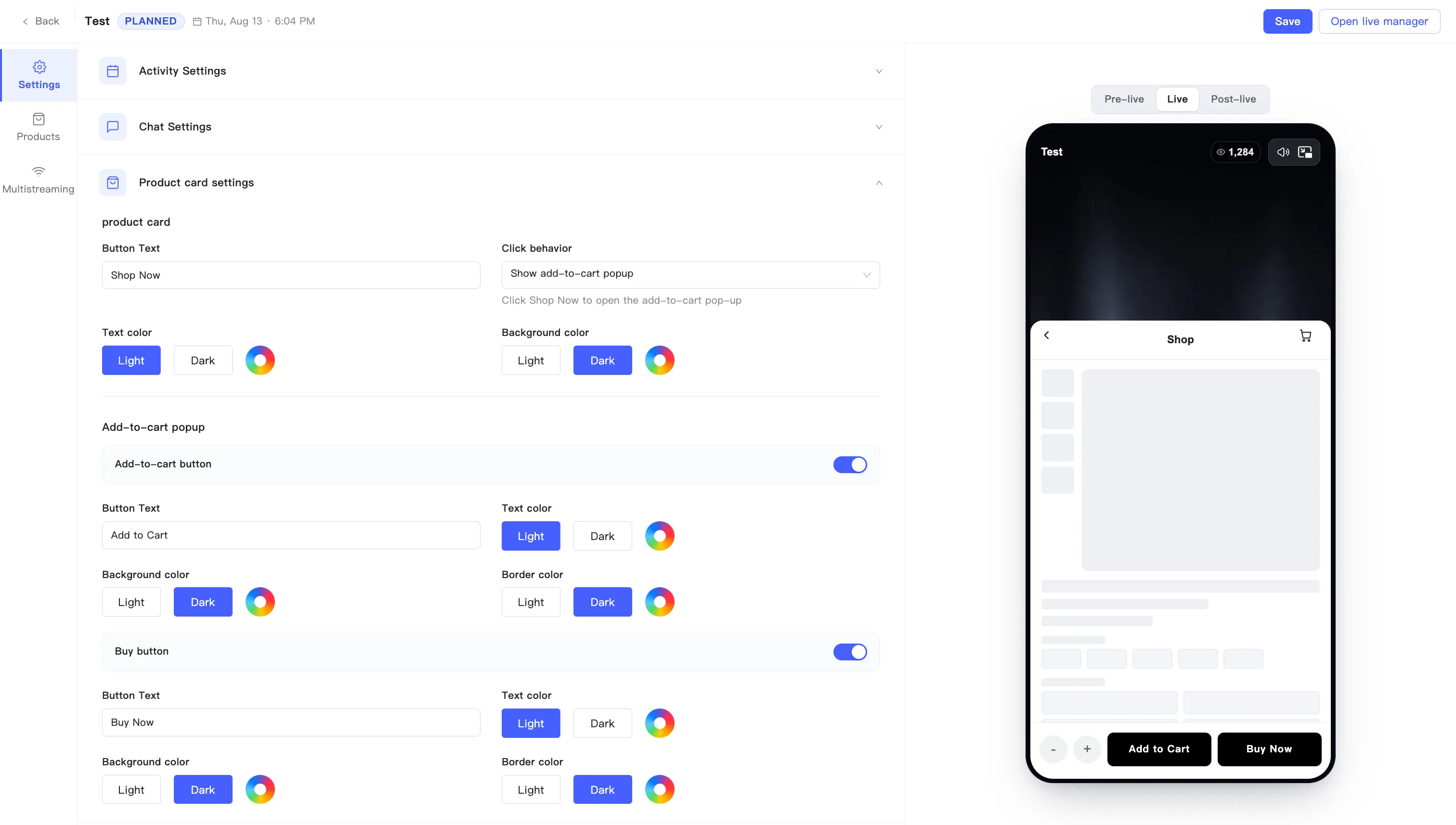
Customize the product card
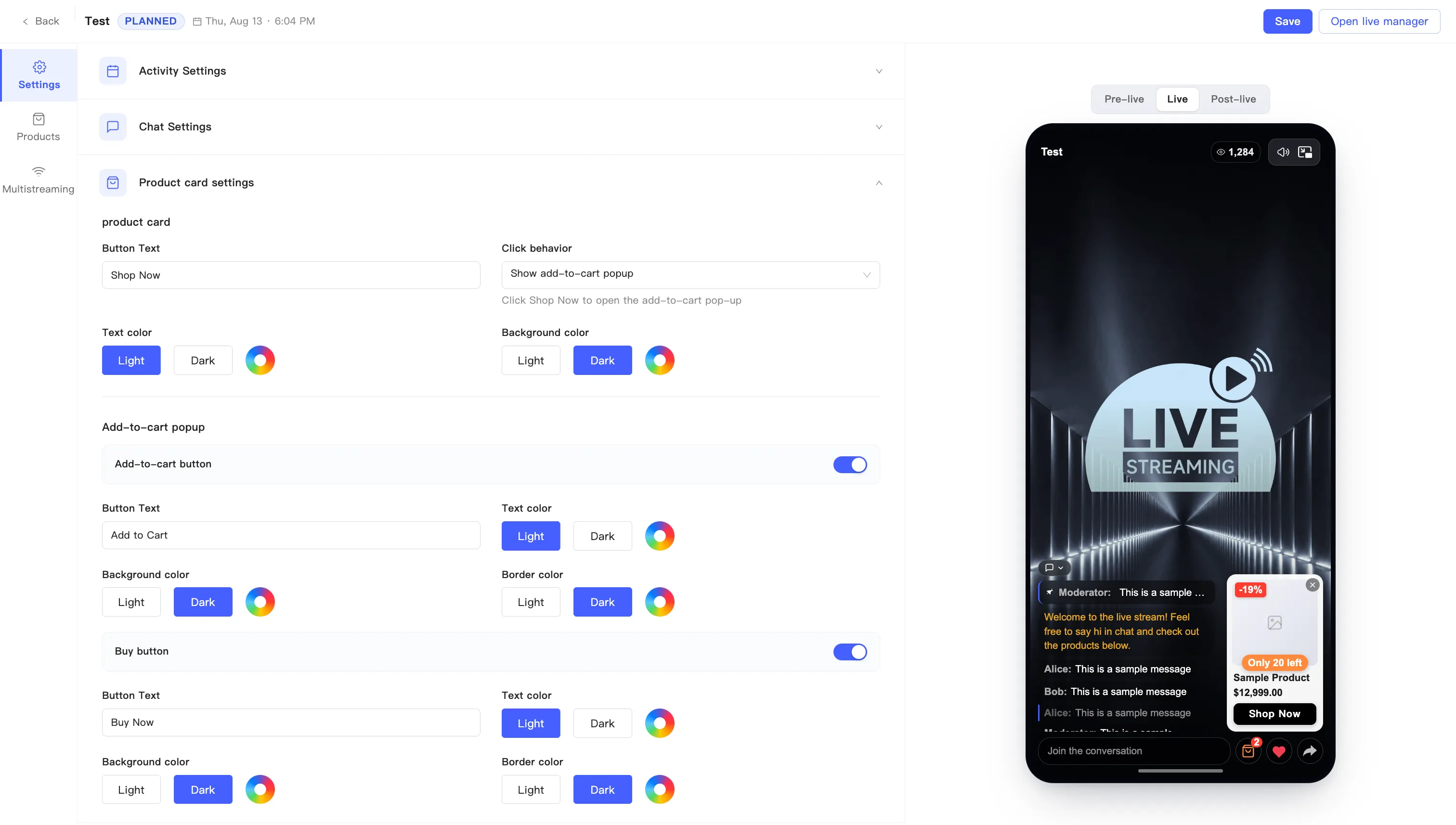
The product card is what pops up for viewers when the host pushes a product. Product card settings controls its button copy, its colors, and what happens when someone taps it.
On the event editing page, stay on the Settings tab and expand Product card settings. Click Save at the top right when you are done.
product card
Section titled “product card”This half covers the card inside the live room.
| Field | Notes |
|---|---|
| Button Text | The call to action on the card. Defaults to Shop Now |
| Click behavior | Either open the add-to-cart pop-up or send viewers to the product page |
| Text color | Button text color |
| Background color | Button background color |
Every color field uses the same control: pick the Light or Dark preset, or open the color wheel on the right for anything else.
Click behavior decides where a tap goes:
- Show add-to-cart popup — tapping Shop Now opens the add-to-cart pop-up. Viewers order without leaving the room.
- The other option sends viewers to the product detail page instead.
Add-to-cart popup
Section titled “Add-to-cart popup”This block only appears when Click behavior opens the pop-up.
The pop-up has two independent toggles, Add-to-cart button and Buy button, each with its own fields:
| Field | Notes |
|---|---|
| Button Text | Add to Cart for the add button, Buy Now for the buy button |
| Text color | Button text color |
| Background color | Button background color |
| Border color | Button outline color |
Colors work the same way: Light and Dark presets plus the wheel.
Turn a toggle off and its fields collapse with it.